
At the UC Merced IT department we get a lot of angry stressed out people yelling at informing us that one or several of our systems/services are down(e.g. email, cloud storage, wireless network, etc.) and are anxious to find out when they will come back online. Yea yea, big cliche, every IT department has people hating on them, but seriously, sometimes we deserve that hate.
If you’re at UC Merced and you can’t access CROPS (our Learning Management System), the third thing you’re going to do is go to it.ucmerced.edu and check the “systems status” block.
My boss asked me to redesign the “system status” and it was great how he approached it. It was at the tail end of an hour long 1-on-1 meeting and he says, “Oh yea and there’s one more thing I want you to look at. This ‘Network Status’ block on the right here, it’s (shakes his head) not workin so great (exhales). I need you to do something with it, like redesign it somehow to be, (pauses, then exhales) I don’t know, better. But just take a few hours with it real quick.”
After I got over his ambiguous word choice to describe the issue I began asking him questions that would give me specific answers; the initial discovery phase in the design process.
What three things bother you about it?
Do you have any user stories?
What negative things have people told you about it?
What do you want/expect your users to do when they visit?
What about it do you think works?
etc.
A lot of it came down to spacing issues between the different elements in the block and figuring out a layout that doesn’t frustrate people when they use it. I made it very clear that redesigning this would take more than just “a few hours” (I love it when people minimize the importance of design) but the result would be worth it.
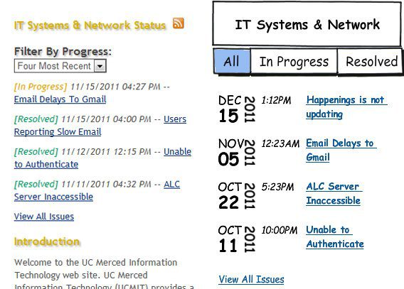
As of 12/9/11 this is what our beautifully designed IT home page looks like (No, I didn’t design this).
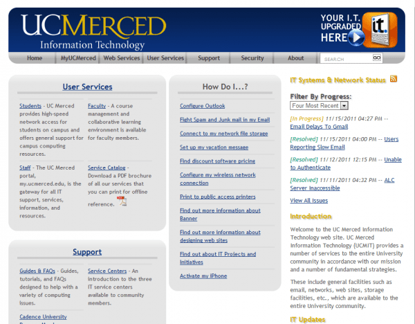
The section on the right where it says “IT Systems & Network Status” is what you’re going to care about. Here’s a close-up:
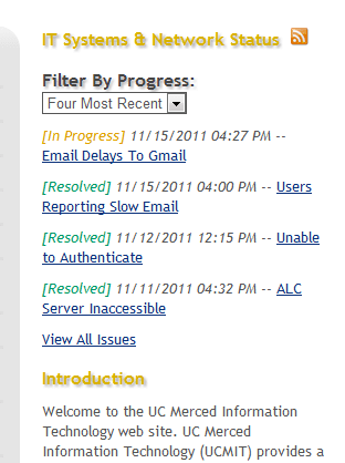
A few design issues come to mind:
1) The drop-shadow on the title seems to be making it less legible
2) The dropdown menu under “Filter By Progress:” gets lost and a lot of people end up not using it. We get a lot of “Oh, I didn’t know I had a choice of selecting ‘Four Most Recent’, ‘Resolved’, or ‘In Progress’ issues”.
3) This might just be me but you kinda’ have to strain your eyes and find the date and time stamp of each issue. If I’m frantic about email being down, I’d like to be able to scan this list quickly and see if there’s been an update today.
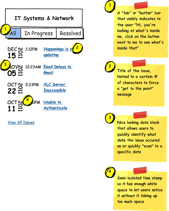
After a few hours of sketching, thinking and random hallway testing I drafted this mockup with the following justifications:
Here’s the mockup without the callout points and sticky notes:
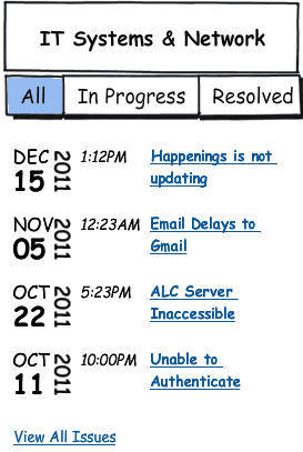
If you read point 1, you’ll notice that this solves the issue of users not knowing they had the option of choosing to see “All” issues, “In Progress” issues and “Resolved” ones.
Point 2 follows the spirit of Twitter’s “keep it short” mentality by forcing the updater to create a simple title without cluttering the interface with details. “Single Sign On is down” is much better than “Single Sign On service being disrupted by server reset”. The majority of users don’t care why Single Sign On is down, they just want to know if they’re the only ones that can’t sign on and whether or not IT is aware of it so they don’t have to call/email the Help Desk to inform them.
I styled the date block in point 3 to be quickly scannable because sometimes there are multiple issues listed on the same day or close to a certain date (when it rains, it pours). Having the dates easily discerned allows users to quickly scan the list of issues to see if their particular problem has been reported. “Hmm I can’t connect to the network. Today’s the 15th so has anyone reported the problem yet? Oh yep, there it is.” My boss said he imagined this list displaying more than four issues at a time so being able to quickly scan it is a good thing.
I can’t make everything big and bold but I do need to make everything clear and noticeable; so for point 4 I chose to take advantage of the white space to single out the time stamp and italicized it to differentiate it from the title to the right.
Here are the two side by side:
Which would you prefer?
At this point (12/12) it’s ready to be prototyped and I’m going to forgo using Photoshop because this isn’t an extremely large project and creating it in the browser would go much faster, especially with CSS3 being able to handle drop-shadows, gradients, border-styles and even cool hover effects. I’ll update this post with the final result.